|
Tools - Define action toolbars... |
|
The menu item "Tools → Define action toolbars..." offers settings in the following tabs:
The dialog "define action toolbars" can be opened also by right-clicking the "Actions toolbar", the "Favorite tools toolbar" or the "Main splitter toolbar".
Toolbars


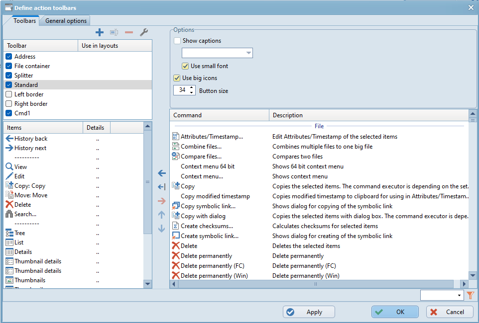
Under the tab "Toolbars" the FreeCommander toolbars can be defined and customized. The dialog consists of the following groups:
- Toolbar list
- Options of the highlighted toolbar
- Item list of the highlighted toolbar
- List of commands
- Details for a toolbar item
The toolbar list initially contains the following toolbars:
- Address
The "Address bar - actions toolbar" is shown at the right border of the address bar. - File container
If a file container tab is active, the "File container toolbar" is shown at the right border of the address bar. - Splitter
The "Main splitter toolbar" is shown between the two panels. - Standard
The standard toolbar is shown within the "Actions toolbar". - Left border
On the left border of the FreeCommander main window an additional toolbar can be shown. - Right border
On the right border of the FreeCommander main window an additional toolbar can be shown.
Only the toolbars that are checked in this toolbar list are shown in the FreeCommander main window.
The following buttons are offered for the editing the toolbar list.
 add a new individual toolbar. Individual toolbars are shown in the actions toolbar.
 rename the highlighted toolbar. This function is active for individually added toolbars only.
 delete the highlighted toolbar. This function is active for individually added toolbars only.
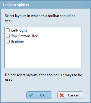
 opens a dialog to check in which layouts the highlighted toolbar should be shown.
If no layout is checked, the highlighted toolbar is active in all layouts.

Options of the highlighted toolbar
- Address toolbar
There are no options offered for the address toolbar.
- File container toolbar
There are no options offered for the file container toolbar.
- Splitter toolbar
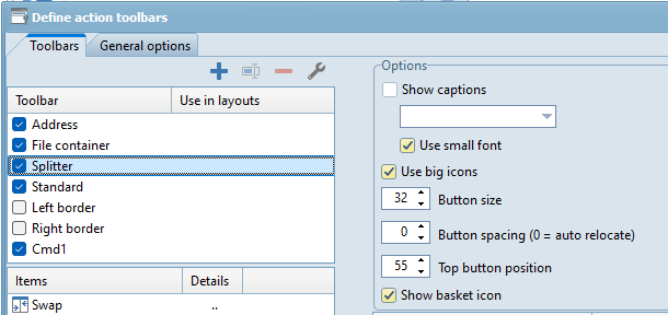
If the main splitter toolbar is highlighted in the list of toolbars, the following options are offered in the group "Options": - Show captions
If this option is checked, the items of the standard toolbar are shown with the following settings: - The location of the caption
- On the right
- At the bottom - Attention: the titles are completely visible, only if there is enough space left for the font size below the icon.
- On the left
- At the top - Attention: the titles are completely visible, only if there is enough space left for the font size below the icon.
- Use small font
If this option is checked, the titles are shown with a smaller font. The is mostly necessary, so that the height of title and icon fully fit in the button. - Use big icons
If this option is checked, the items of the splitter toolbar are shown with larger buttons. - Button size
The button size of the items of the splitter toolbar in pixel. - Button spacing
The distance between the buttons of the splitter toolbar in pixel. If the button spacing is "0", the distance is calculated automatically. - Top button position
The distance of the topmost button of the splitter toolbar from the upper border in pixel. - Show basket icon
If this option is checked, the Windows button "Recycle bin" is shown at the end of the splitter toolbar.
 - Other toolbars
If the in the list of toolbars
- the standard
- the left border
- the right border
- or an individually added
toolbar is highlighted, the following options are offered in the group "Options": - Show captions
If this option is checked, the items of the standard toolbar are shown with the following settings: - The location of the caption
- On the right
- At the bottom - Attention: the titles are completely visible, only if there is enough space left for the font size below the icon.
- On the left
- At the top - Attention: the titles are completely visible, only if there is enough space left for the font size below the icon.
- Use small font
If this option is checked, the titles are shown with a smaller font. The is mostly necessary, so that the height of title and icon fully fit in the button. - Use big icons
If this option is checked, the items of the standard toolbar are shown with larger buttons. This option does not fix the button size automatically, this has to be done manually. - Button size
The button size of the items of the standard toolbar in pixel.
Item list of the highlighted toolbar
For the list of items of the highlighted toolbar the following editing functions are offered:
- Clicking the button
 adds the command (highlighted in the command list on the right) to the list of items of the highlighted toolbar (on the left).
 - Clicking the button
 adds a separator to the list of items below the highlighted item of the highlighted toolbar.
 - Clicking the button
 deletes the highlighted item from the highlighted toolbar.
 - Clicking the button
 moves the highlighted item in the list of items one item up.
 - Clicking the button
 moves the highlighted item in the list of items one item up down.
 - Clicking the button
 (in the column "Details" of the list of items) opens the dialog "Details for...", where the details of the item preceding the button can be defined.
The list of commands contains all commands that can be added as a toolbar item. Clicking the button  adds the highlighted command to the list of items of the highlighted toolbar below the highlighted item.
Clicking the column "Details" (in an item row) in the list of items opens the following dialog, where details for this item can be defined:

Caption
The input edit field "Caption" allows to rename the title of the item. Initially the caption is the name of the assigned command.
If several items of a toolbar have the same group index, only one of them can be active at the same time.
Example: In a panel either the "List view" or the "Details view" can be active. Therefore the items "List" and Details" have to have the same group index. An item with group index "0" is independent of the other items. It acts as a function button (e.g. "Unpack...") or an on/off button ("File system tree panel" on/off) and not as a switch button ("List view").
Icon
If an icon file is selected under "File", an icon contained in this file can be selected here, that should be used for the item.
File
If the standard FreeCommander icon should not be used for the highlighted item, a file containing icons (*.exe, *.dll, *.icl, *.ico) can be chosen here.
If this option is checked, the item is not shown as an icon, but as a drop down arrow  , to open a popup menu.
Example: The standard toolbar contains the item "thumbnails" twice, as icon  and as drop down arrow
  .
.
Either an "Internal popup menu" or an "Individual popup menu" (defined in this setting) can be assigned to an item. As soon as a popup menu is assigned to an icon, a drop down arrow  is shown behind the icon, than indicates that clicking the icon opens a popup menu.
An "Individual popup menu" can be defined only, if no "Internal popup menu" is assigned to the item.
An "Individual popup menu" has to contain at least one action (command) in the "List of popup menu actions".
For the list of popup menu actions of the highlighted item the following editing functions are offered:
- Clicking the button
 adds a new action (command) to the list. For this purpose a group of commands has to be selected first:
 - File
- Folder
- Edit
- View
- Tools
and afterwards the command itself has to be selected.
- Clicking the button
 deletes the highlighted action from the list of popup menu actions.
 - Clicking the button
 moves the highlighted action in the list of popup menu actions one action up.
 - Clicking the button
 moves the highlighted action in the list of popup menu actions one action down.
The following "Internal popup menus" are offered:
- $FcPopup_HistoryFolders: lists the last 30 folders - used for the buttons "History back" and "History next"
- $FcPopup_DesktopFolder: a popup menu with all files/folders/shortcuts shown on the desktop
- $FcPopup_SystemFolders: a popup menu with folders to be found in all Windows versions - predefined Windows system folders
- $FcPopup_StartMenu: a popup menu with all Start menu items.
- $FcPopup_FavoriteFolders: a popup menu with all favorite folders.
- $FcPopup_FavoriteTools: a popup menu with all favorite tools (Tools → Favorite tools)
- $FcPopup_DetailViews: a popup menu with all column profiles (Tools → Settings → Column profiles)
- $FcPopup_Filters: a popup menu with all defined filters (Folder → Filters)
- $FcPopup_Thumbnails: a popup menu with possible sizes of thumbnails
- $FcPopup_SearchProfiles: a popup menu with search profiles (File → Search" - tab "Profiles")
- $FcPopup_ShellNew: a popup menu with Windows commands to create a new file/folder
- $FcPopup_Layouts: a popup menu with defined layouts
- $FcPopup_PredefinedQuickFilters: a popup menu with predefined quick filters

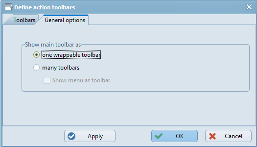
Under the tab "General options" the following settings can be defined for the "Actions toolbar":
Show main toolbar as
The "Actions toolbar" shows the "Standard toolbar" and all added "Individual toolbars".
The actions toolbar can be shown in the following ways:
- One wrappable toolbar
All items of the "Standard toolbar" and of all added "Individual toolbars" are shown in one row. If the row width is to small to show all items, the toolbar is wrapped (the items are shown in more than one row). - Many toolbars
Each toolbar is shown separately. Each toolbar can be moved separately.
Show menu as toolbar
If the option "Many toolbars" is selected, it can be checked, that the main menu is also shown as a toolbar. In that case the main menu can be moved within the other toolbars.
Menu is displayed as a toolbar if at least one other toolbar exists for the display. This condition is fulfilled if:
- at least one action toolbar in the main area is defined for the display
- if no action toolbar exists for the display in the main area, at least one favorites toolbar to display must exist and the "Integrate favorite toolbars with action toolbars" option must be active
Use flat symbols (size: 20x20, 32x32) - restart needed
If the option "Use flat symbols (size: 20x20, 32x32) restart - needed" is checked, the action toolbar symbols are shown as flat icons (sizes: 20x20 and 32x32).
If the option is not checked, they are shown in sizes of 16x16 and 24x24.
To make changes of this option effective FreeCommander has to be restarted.
