|
Tools - Settings - View - Status bar - |
|

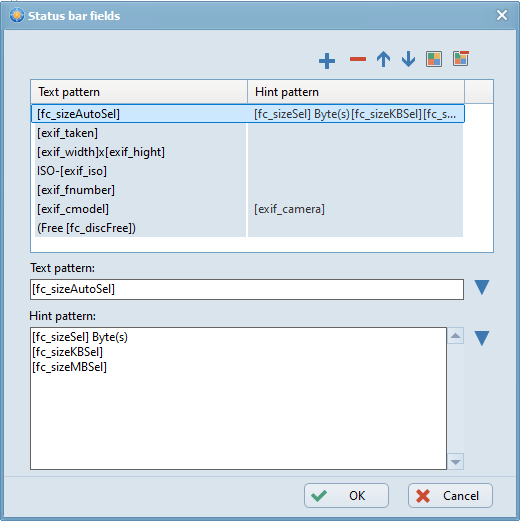
Clicking the  button in the "Status bar" dialog opens a window where the details of the highlighted item can be defined. The content of the status bar is made up of the fields listed in this window.
Add new field
Clicking the  button opens a new row in the list of status bar fields. "Text pattern" and "Hint pattern" can be defined for this field.
Delete field
Clicking the  button deletes the highlighted field.
Move field up
Clicking the  button moves the highlighted field up one row, causing it to be shown further left in the status bar.
Move field down
Clicking the  button moves the highlighted field down one row, causing it to be shown further right in the status bar.
Text color
By clicking the  button, the text color of the highlighted field can be chosen.
The text of the highlighted status bar field can be specified here. The text may consist of independent characters and wildcards (replaced at run time). Clicking the  button opens a list of wildcards (see below). The chosen wildcard is inserted at the cursor position.
Hint pattern
The text for the tooltip of the highlighted status bar field can be specified here. This tooltip appears when the cursor is above the status bar field. The text may consist of independent characters and wildcards (replaced on run time). Clicking the button opens a list of wildcards (see below). The chosen wildcard is inserted at the cursor position.
