Triangle sort sign could benefit from slight adjustments
Posted: 29.12.2022, 14:43
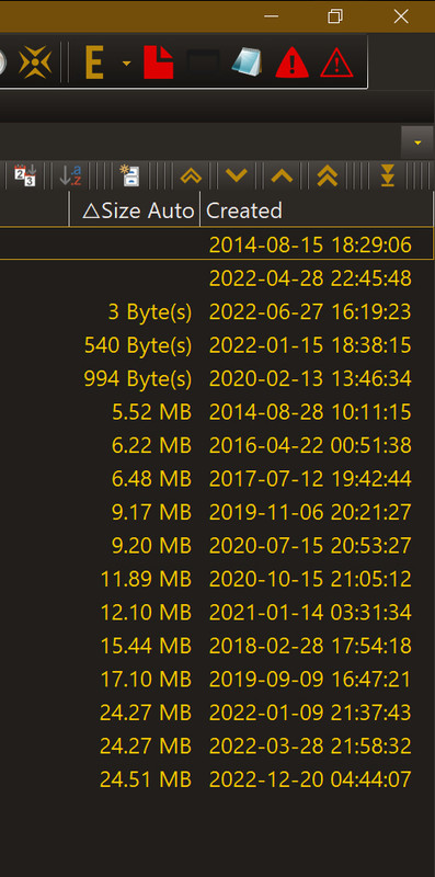
In the new 880 32-bit public version the Column by which items are sorted [when user is in Detailed View] gets an empty triangle sign, placed right next to the name of a given Column; accordingly
or
version [depending on the sort order chosen by user in a given moment]
I have two suggestions in regards to this new UI element:
#1] Placing a pause between such triangle sign and Column's name would make things look cleaner
#2] Replacing these empty triangles with opaque ones
would make things look even more cleaner
And so for example instead of something like this
a user could be experiencing something this
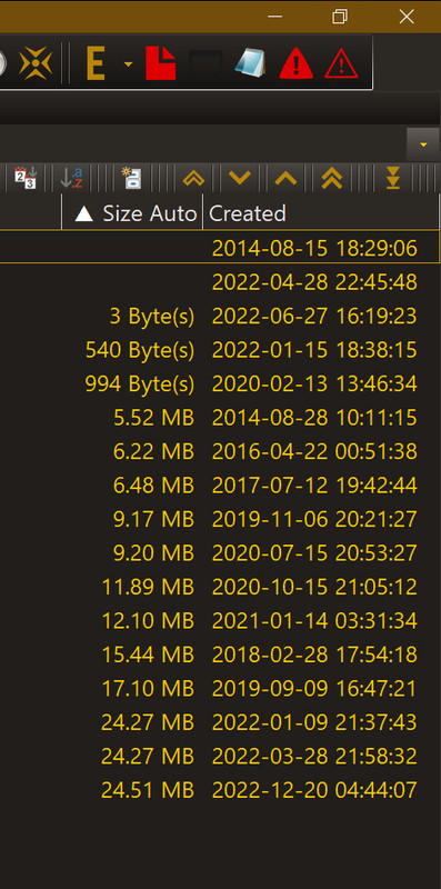
which in my opinion looks much better. And below is an animated comparison of the current UI and a simulation my propositions:

Code: Select all
△Code: Select all
▽I have two suggestions in regards to this new UI element:
#1] Placing a pause between such triangle sign and Column's name would make things look cleaner
#2] Replacing these empty triangles with opaque ones
Code: Select all
▲
▼And so for example instead of something like this
a user could be experiencing something this
which in my opinion looks much better. And below is an animated comparison of the current UI and a simulation my propositions: