
Code: Select all
△Code: Select all
▽I have two suggestions in regards to this new UI element:
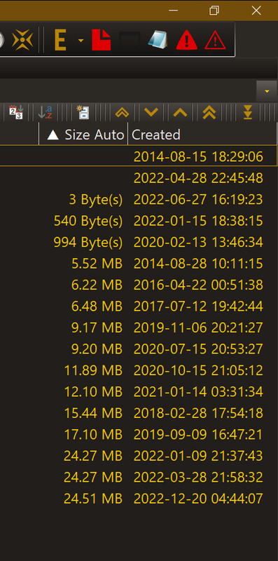
#1] Placing a pause between such triangle sign and Column's name would make things look cleaner
#2] Replacing these empty triangles with opaque ones
Code: Select all
▲
▼And so for example instead of something like this
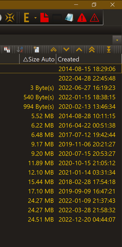
a user could be experiencing something this
which in my opinion looks much better. And below is an animated comparison of the current UI and a simulation my propositions:
