Dreamer wrote: ↑07.11.2020, 12:58
More workarounds, all 1-click:
- toolbar new tab button
- address bar new tab button
1. Both require very large mouse movements to get to, after possibly also having first clicked on an address bar to give focus to one panel or the other.
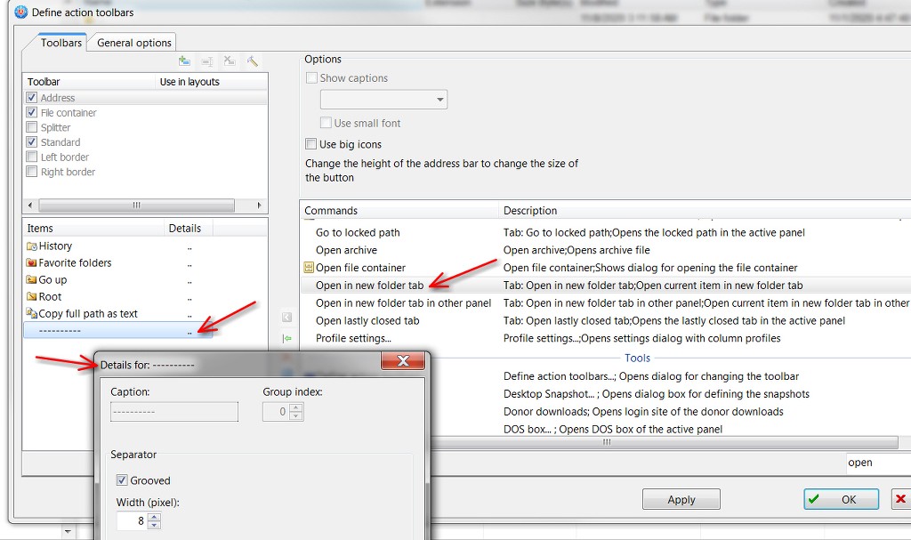
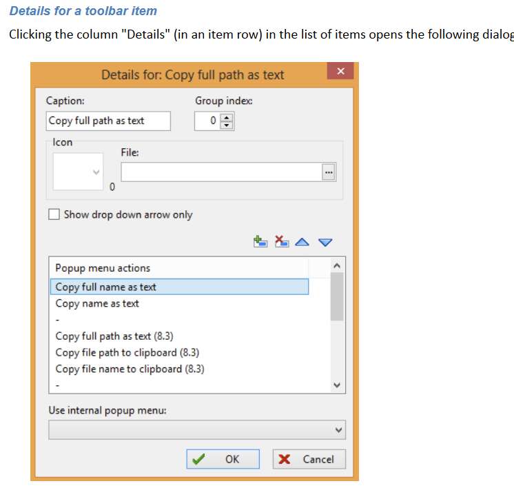
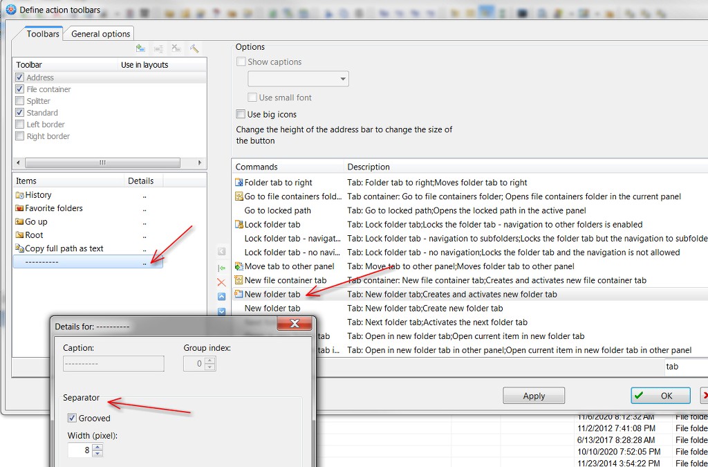
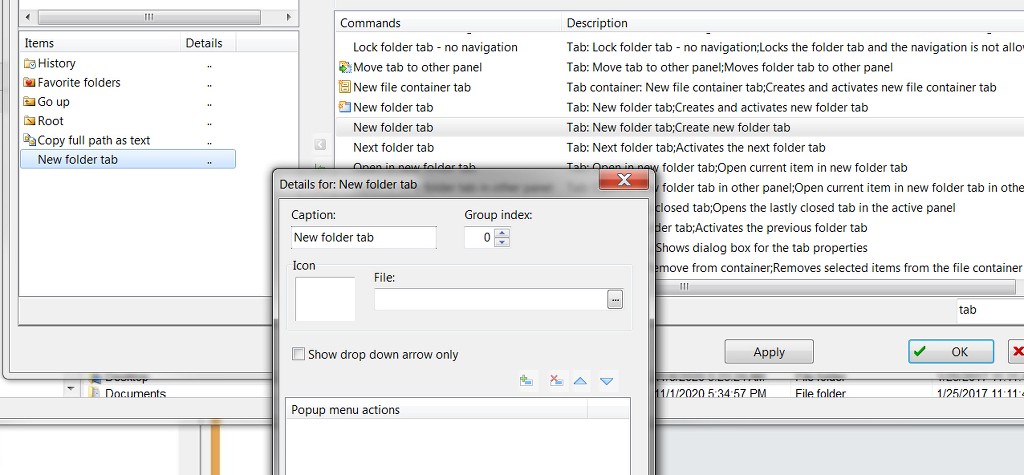
2. Unless I'm doing something wrong, there is no icon which corresponds to "new folder tab" button. It ends up being a vertical line when added. Yes, it looks like an icon when choosing that item from the list, but when added it appears as a vertical line.
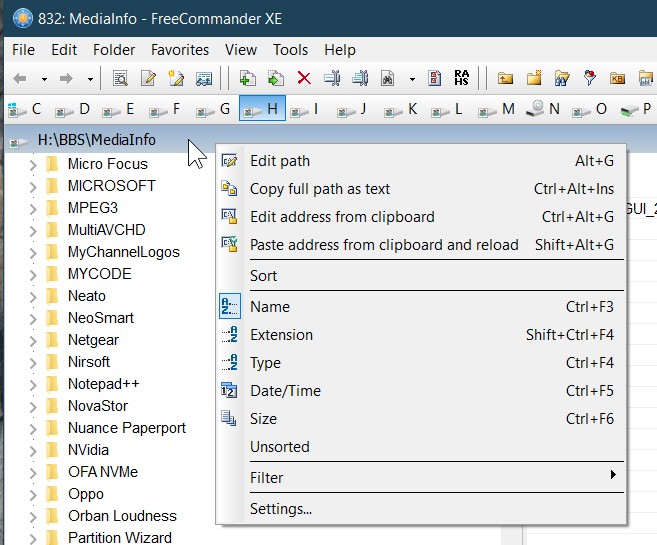
And besides, I'd much rather just position the mouse on one address bar or the other, left-click if necessary to give it focus, and then immediately (with zero mouse movement) right-click and be able to move the mouse over a bit onto the new top context menu item "new folder tab" and left-click.
- splitter bar new tab button
I don't have a splitter bar. I'd rather have the space for detail rows in top/bottom panels.
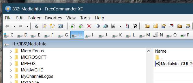
- middle click the address bar path folder, e.g. C:\One\Two\Three - you can click to C:, One, and Two to open these as a new tab
- middle click any folder in the file list
Cute. I was not aware of this. Definitely a slick way to get a tab pre-populated with a folder without any real extra mouse/keyboard navigation.
But my Logitech MX Performance mouse doesn't have a physical middle button. It has a wheel that spins for scrolling up/down, which can also be pressed and then functions as a middle button. But I'm not comfortable just pushing it down because the wheel spins, and I'm much more accustomed to spinning it to scroll. So I would have to retrain myself to learn how to push it down without thinking. At the moment I find myself currently taking extreme care to try and just push it down, to accomplish the trick you suggest.
But thanks for this tip. Maybe with practice I would become comfortable with this technique.
BTW Why are you using option to hide tab bar with 1 tab opened? You could right click tab and open new tab easily, try the option "Always keep one tab open".
In the old days with smaller screens I was much more interested in available vertical space for detail rows in a pane (remember I use over/under split screen appearance). The loss of vertical space caused by the extra row for tabs was not something I wanted to give up. Maybe I shouldn't be so stingy.
Also, I actually don't normally use tabs (although I obviously realize it's of great utility and convenience). I find it hard to break the habit of just having a top/bottom and looking at no more than two folders at a time, both of which are shown in their Address Bar and always visible... with no tab needed above. I realize it's clearly no different than learning how to use multiple navigation tabs in any app, be it a browser window or Foxit etc, where there is simply always a tab bar and where it would be impossible to survive without tabs to easily navigate between many open items.
I just don't have the habit of leaving folders entered with FCXE open while then opening a new tab to go to another folder (although I probably should develop that habit since I do commonly find myself returning to an earlier examined folder in the same FCXE program session), so that I have 3, 4, 5, etc. open folders in the top/bottom panels... unless I want to or need to. But it's only occasional. I simply navigate through top or bottom panels, one folder at a time. Old fashioned and very elementary I know, and I'm not proud. I probably need to spiff up my FCXE techniques.
With today's larger higher resolution screens the precious vertical space is no longer really an issue. So maybe it's time for me to really "go into FCXE re-training" and just force myself to get accustomed to using tabs here as well, not to mention "favorites". Both of these features are really fundamental super-conveniences and I should avail myself of them, which I don't.
Still... I see no reason why it would be a bad thing to add "new folder tab" to the top of the right-click context menu on the Address Bar.